
Case Study: Craigslist Redesign

Navigation
Case Study: Craigslist Redesign
Giving Craigslist new features and a new look to increase trustworthiness
My Roles
My responsibilities included the following user interviews, sketching, low fidelity prototyping, A- B testing & high fidelity prototyping
The Problem
We have observed that people seeking secondhand goods struggle with trusting the current Craigslist branding which causes them to move to other platforms with a better reputation and aesthetic
The Solution
To redesign Craigslist into a more trustworthy and reliable site for buying and selling secondhand goods as well as streamline the these processes
User Research
Competitor Analysis
Offerup
Facebook Marketplace
Goodwill
Strength
- verified users
- promotes safety
- user-friendly
- variety of products
- vast number of users
- profiles to verify seller
- simple categories
- trusted & well-known
- physical locations
- sanitized items
- ability to treasure hunt
- no haggle on price
Weakness
- must have an account to use service
- limited to your area
- pay for prime listing
-must have an account to use the service
- no haggle on price
What people want: Survey & Interview Results
86%
used online platforms to buy/sell items
82%
have used Facebook Marketplace over CL
89%
have purchased second-hand items
We interviewed 5 people who have used Craigslist before or enjoy secondhand shopping. The following are some of the key words they chose to describe Craigslist:
"Dangerous"
"spammy"
"a little sketch"
"ghetto"
"shady"
Who our user is: User Persona

"Jane is a motivated thrifter who needs a trustworthy online market with a good amount of buisness to find awesome deals and to sell her items"
Definition & Ideation
The Hard Part: Reorganizing Links With Card Sorting
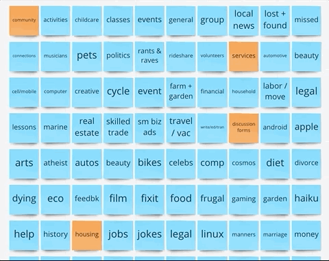
We began by writing and analyzing all 218 current links that are present on Craigslist's Atlanta homepage. We examined each section (orange) and their subcategories (blue). This allowed us to determine what was redundant or could potentially be grouped together.
Step 1:
Step 2:
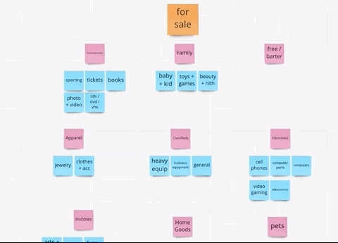
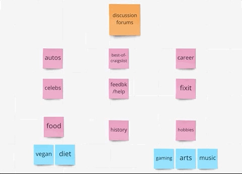
During the second step we eliminated any redundant main categories and combined subcategories. We then reordered the location of many of the subcategories. For instance, we removed the gigs main section and combined it with the jobs section. We ultimately decided on 4 main sections for users to interact with.


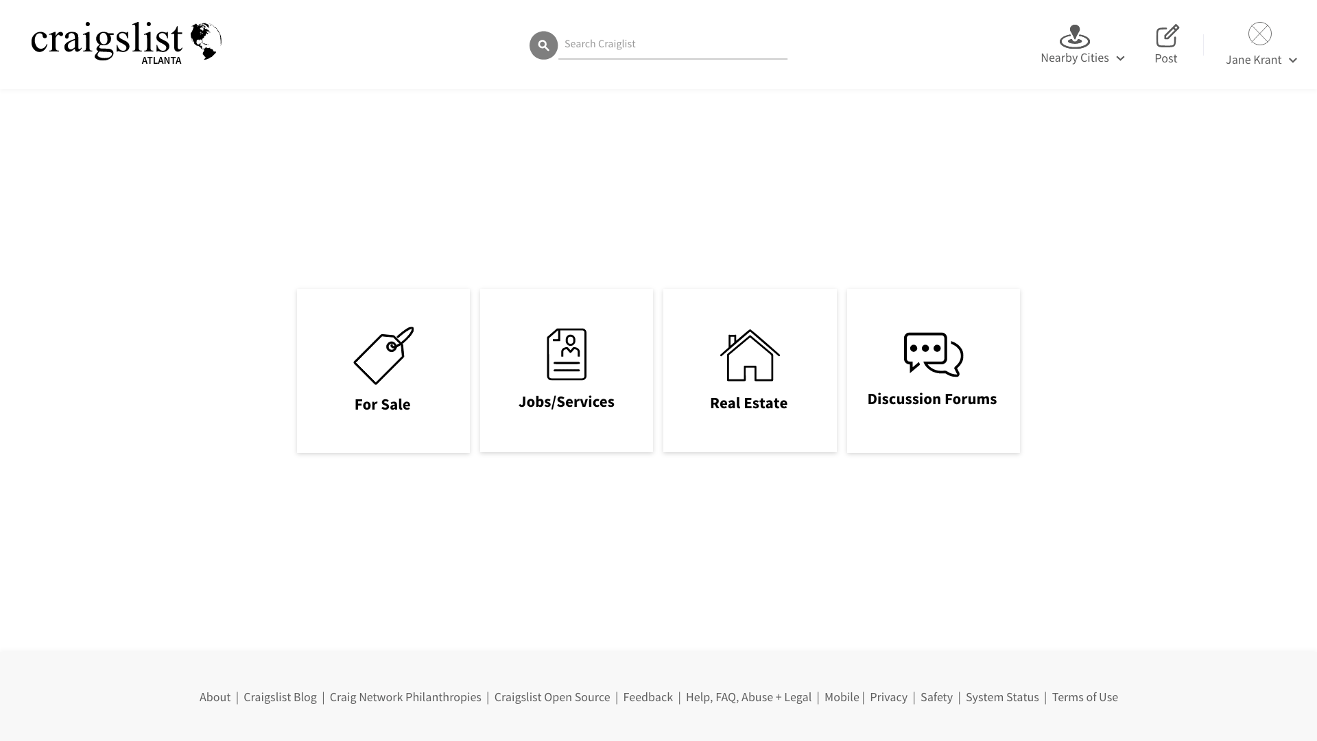
Sitemap
Our final site map allowed us to visualize our card sorting in a clean and defined manner. This details the many paths our users can take.

Prototypes & Testing
A/B/C Testing
Our team decided to perform A/B/C testing to determine what the best layout for our for main categories should look like.
The following are our various iterations of the Jobs page.

Low Fidelity Testing & Responses
We tested 6 different users with 5 tasks. With their feedback we made the following changes:
- increase text and icon size
- rename jobs to jobs/services
- add profile for seller on listing
- split the login and sign up buttons
- add more filters
- add posting dates
- rename cl nearby to nearby cities
- add contact seller button at the bottom of the listing
Final Prototype & Thoughts
Style Guide


What I've Learned

While going through this project I learned that looks do matter. Our goal was to elevate the look and feel of the Craigslist and streamline the user flow. I designed the pages of this website with a familiar look to other successful platforms to keep our users engaged and in the loop. Most importantly I learned that "if it ain't broke don't fix it." Craigslist has a great and well known structure so it was crucial to keep the general structure but give the website a modern look.